Megaregions of the World
Why the map was made
About a year ago on January 31st 2021 Philip Kearney posted his map of the megaregions in the United States, see his post. The map is quite beautiful. In bright neon colors he shows of the megaregions of the United States. Giving core urban centers a bright white color which enhances the spatial awareness. The whole map is an efficient and entrancing display of the demographics in the US.
A friend of mine shared this in our group app and noted that the criteria of 20+ population per square kilometer was much too low for other regions such as Europe. His guess was that Europe would just be one giant blob. Of course, at the time I was writing my thesis and thus I dropped my responsibilities and had a good mornings worth of fun with recreating this map.
Gathering the data
I have a bit of experience with tracking down maps and data for these types of projects, and I’d like to share some wisdom in this regard. Particularly, that you may encounter companies who are selling this data for ‘fat loot’. I’ve never bought anything of these companies, particularly because I’m well aware that a lot of data is available for free, or its neighbors are available for free. This project was a good case of that. The information was being sold, but I knew that typically demographics data is available for free. This type of information is also often stored in the ‘tiff’ format which helps in these searches.
So, after a bit I found a map of population estimates for the earth hosted by the European Commission in the GHSL (Global Human Settlement Layer) data set. This data set contains loads of useful data on human settlement at impressively high resolution. And it’s free! So if you’re interested in doing your own project, keep this data set in mind. Particularly, bodies of the European Union tend to post a lot of data freely available and of high quality.
Anyway, GHSL contains our data, a map of the population of earth with a sweet resolution of 43200x21600 pixels. Just press download. Now all we need to do is process it to something usable and we can make our map!
Processing the data
Crafting this data into something usable involves a few steps. First, the size of the map. I’m using python and I’m writing custom functions to solve some of these problems and I know that the map size which I got was way too detailed for my poor little computer, partly for memory issues but mostly because of computation time. Maps are two-dimensional objects which usually means that algorithms need squared more computation time with increase in fidelity. In other words, computation time for a map of 43200x21600 is going to cost at least one-hundred times more computation time than a map of size 4320x2160. From previous experience, I know that 4320x2160 gives good clarity and doesn’t take days to compute, unless we write really bad code. Most of the heavy lifting will be done by numpy which utilizes Fortran and C code, so for a lot of the simple stuff we’re good. Including down scaling the original with a factor 10. Easy, peasy.
With a smaller map we now want to compute the density. This can be easily done by approximating the earth as a sphere, estimating the area of the sphere at a pixel and dividing the population by the area. Estimating the area of the sphere sounds difficult to do, but it can be done simple enough. The projection most often used for these types of data maps is the equirectangular projection which is fancy for simply using longitude and latitude directly. This is handy, because area computation is easy with these. If i is the index along the y-axis of your map, starting at 0 and ending at N-1, then sin(pi*(i+.5)/N) estimates the area of that pixel on the sphere. You can derive this using trigonometry and linear approximation, I may do a blog post on this calculation as I’ve used it many times before. It works well enough when we are dealing with large enough numbers which we are. We just need to ensure that we scale the area on the sphere to the area on the earth. Sum all estimates, and divide them by the result. This ensures that the total area is 1. Now multiply the estimates with the actual surface area of the earth, and BAM! We have our area estimate. If we sum all the area estimates we get exactly the surface area of the earth. Precisely what we need.
Now we have our population estimates and our area estimates and together they give our population density estimates. We can use scipy.ndimage.label to find all the contiguous areas. Finally, we need to filter through the areas to find the ones that have at least 2 million inhabitants. This is where we need to do a little bit of coding, and this is the part that takes the computer a while. There are a lot of individual areas, and with increased fidelity comes increased computation time. The code isn’t anything complicated, with clever coding we might’ve been able to reduce the computation time, but all of this is costing code time and we’re running this only once. In short, we’ll wait ten minutes and get our results back.
Visualization
Surprisingly it is only now that comes the hard part. The computing the data took a bit, but it wasn’t too difficult. However, colorization is a problem. If we try to plot the data as is with a randomized color choice for each megaregion we will see a number of neighboring areas with nearly identical colors. This makes it hard to distinguish between megaregions and often two megaregions will be confused for the same megaregion. I’ve written a bit of code which attempts to maximize the color distance between neighboring regions. It does a decent enough job of it. There were a couple of issues in getting the code to work. For one, a distance matrix was needed between the different megaregions. Computing this naïvely led to memory overflows, which was fair because we need to compute the distance between two highly non-convex areas. Similarly to before, we could write complicated code for this, or we can trial and error until we get something simple working. Going for the latter extends our computation time by a couple of minutes, but the result gives a good coloring.
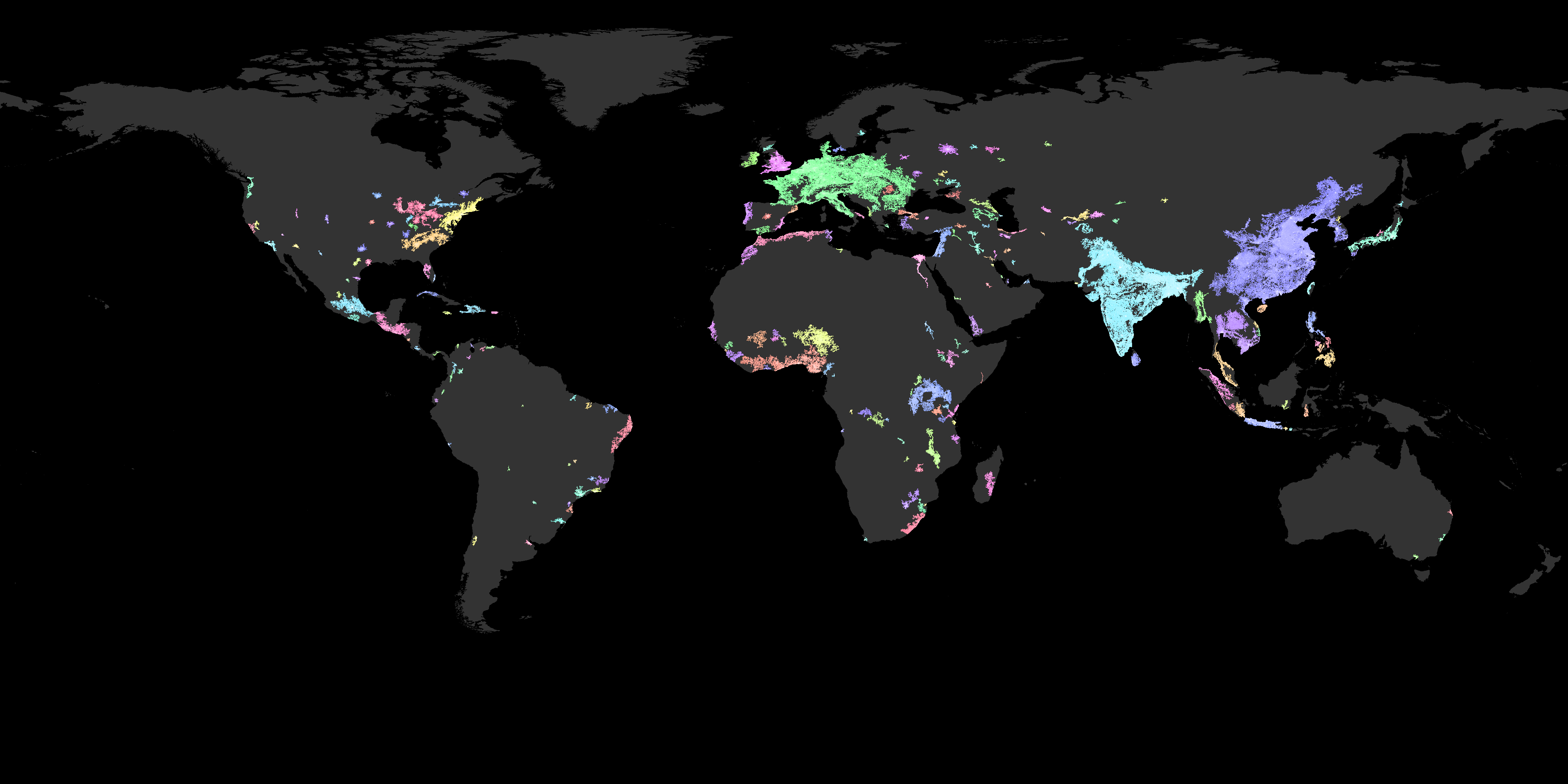
Final result
The final result looks pretty good. It could’ve benefited from country lines and a bit of topography as in the original image of Philip Kearney, but I’m happy with this. Most regions which are nearly touching have a different color, so no confusion there. And, the most important bit, my friend was right. Under the original conditions Europe is mostly one big blob.
However, I want to defend Philip Kearney’s choice for his parameters. His goal was to recreate a map showing the emerging megaregions of the United States. Thus, his original map and criteria were chosen to fit the US only. These parameters would obviously change from country to country, because it depends on a number of factors such as development potential, growth rate, economy, infrastructure, total population, culture, and more. Because, the use of the map is forecasting and the parameters depend on local factors it actually isn’t that useful to extend the same parameters to the rest of the world.
However, it is still revealing. Obviously, we have our three expected blobs: Europe, the Indian subcontinent and East Asia. South-East Asia is in general a densely populated area. Russia is remarkably empty, and the Middle East has a number of historically relevant hot spots still.
Looking at Africa you can see that the West coast has a flourishing population. If you’ll allow me the bit of speculation, it becomes easy to understand that Mansa Musa, a fourteenth century king from Mali, was able to crash the Muslim economy on his hajj to Mecca. According to the story he was so lavish in his gift-giving that the price of gold went into a ten year recession. Comparing the West coast of Africa with the Middle East, it certainly becomes more plausible.
In the East of Africa we see a stretch of blobs. To students of history these should be interesting, as the Northern set of blobs is Ethiopia which has a rich history and culture. Below them we see a blob around Lake Victoria. Again, a bit of speculation, but this blob is interesting because it is nearly connected to the coast. This region is also historically significant. We know that there was trade with this region of Africa, the Arabic and Indian subcontinents. Again, if you’ll indulge my speculation, it may have been the Lake Victoria backbone which supplied the trade network between these regions.
In the Americas, I’m not going to focus on the US as there is plenty of information easily available for your own research. In Middle America I do want to point out that one blob is centered around Mexico City, the blob just to the East of that is a blob that connects Guatemala, El Salvador, Honduras and Nicaragua. Compared to North and Middle America, South America is surprisingly empty. There are some blobs in the North West and some in the East, but that is about it.
Now I also created a map without the two million condition.
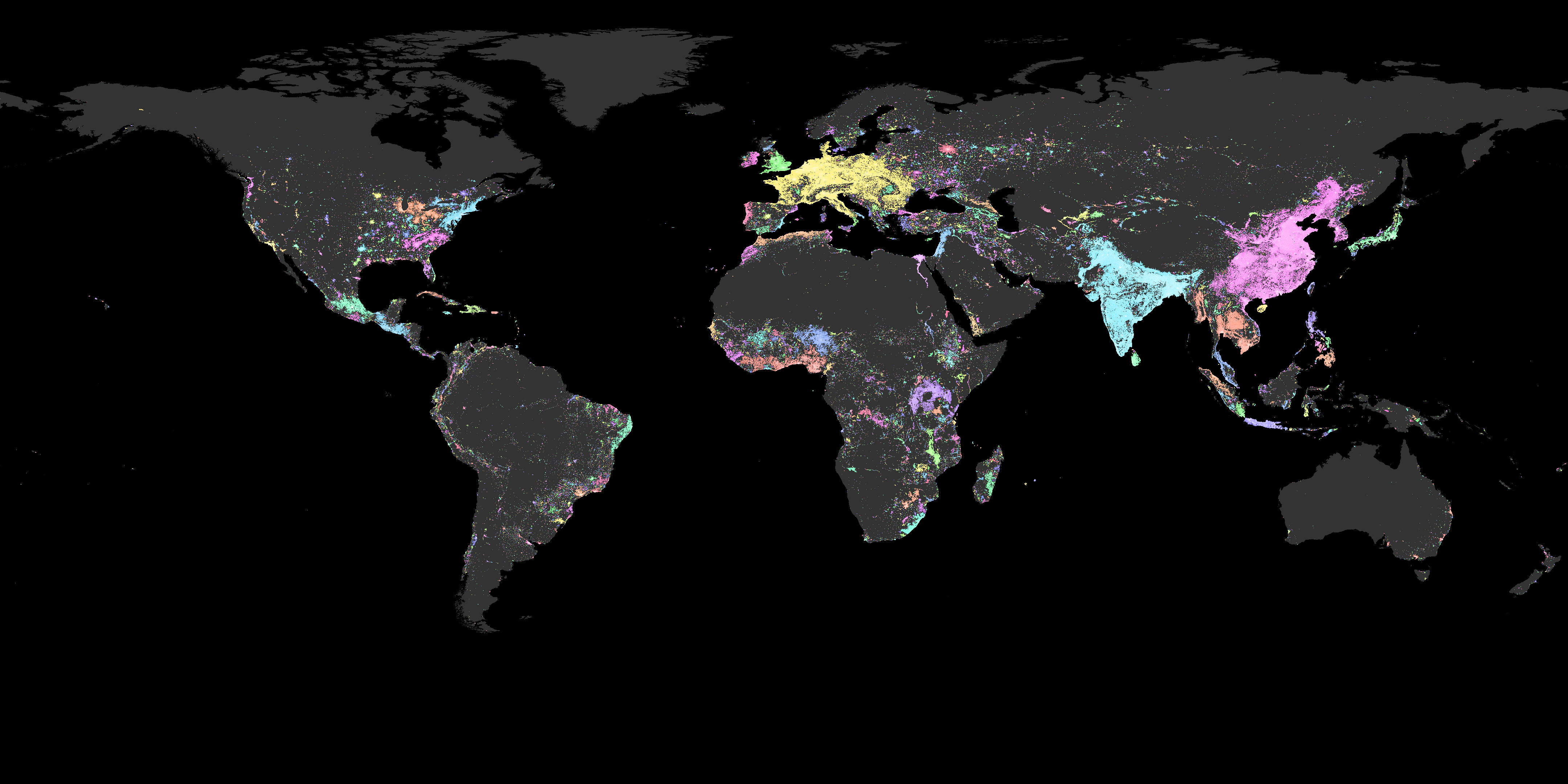
I quite enjoy this version of the map. These maps are supposed to highlight emerging areas and I think that sort of forecasting becomes much clearer in this version. We get these sort of spray can spread patterns and these highlight the direction in which the megaregions can grow.
West Coast Africa has a potential for a lot more connection, as does the Middle East and Russia. The Chinese and Indian blobs on the other hand do not share that potential for expansion. They seem to be limited by the mountains and deserts. In South America we see that the West is mostly occupied along the Andes Mountains, but the East is mostly centered around the coast.
But apart from forecasting we also get a glimpse in the past. The Middle East beautifully outlines the way the Persian Empire was spread out. Similarly, we can see the importance of areas such as Crimea. Finally, paying more attention to Central Asia we can see the effects of infrastructure and railways on the Russian landscape, and we can trace the silk road from China into the Middle East.
For a history nerd there is a lot of stuff to find in both maps, and for me it profoundly changed my perspective of the world. In some ways the potential of the US is highlighted and simultaneously its current importance is diminished. I understand Africa, its importance and its history a lot better now than I did previously. I also think that the expansion of the Mongol Empire is just put in better context in view of this map.
Finally, I would like to comment on the interpretation of this map. Populations tend to have a heavy-tailed distribution, which means that there is a lot of fluctuation in the numbers. The fact that Europe is a bright spot makes interpretation of some geographical qualities difficult, because we might just be viewing an outlier. Similarly, it is difficult to tell from this what the full potential of the Middle East is versus Europe. During the Roman Empire it was thought that the Middle East was much more prosperous and Germany much less profitable. This just means that although I like to speculate about historical relevance of some areas on the map, there is no definitive statistical evidence for this based on this map. I have no doubt that some of the patterns observed actually do relate to historical data, but other might just be what it was: speculation.
I hope you enjoyed these maps! See you in the next post.